Components
Blocks
Stories
Utilities

Enterprise ready Open-Source components
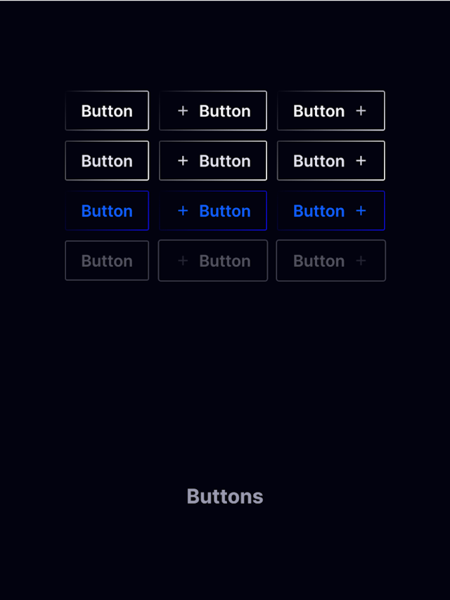
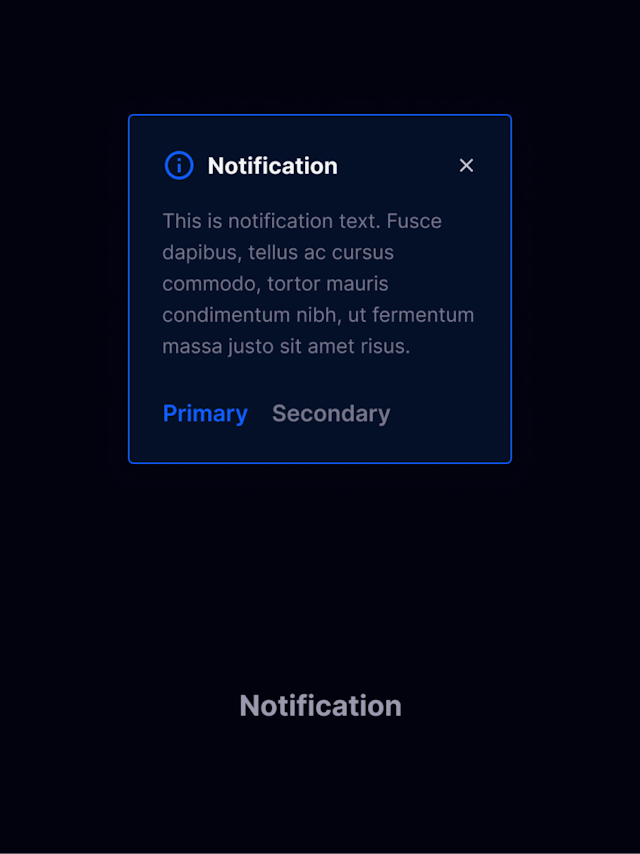
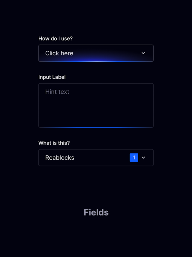
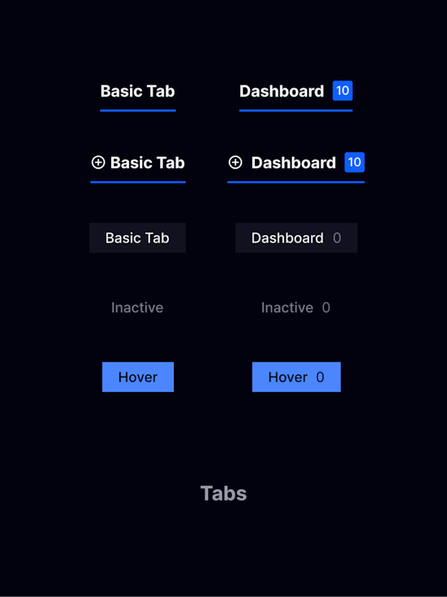
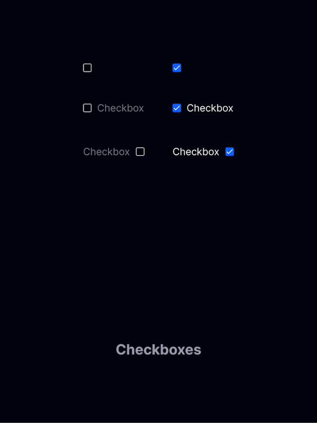
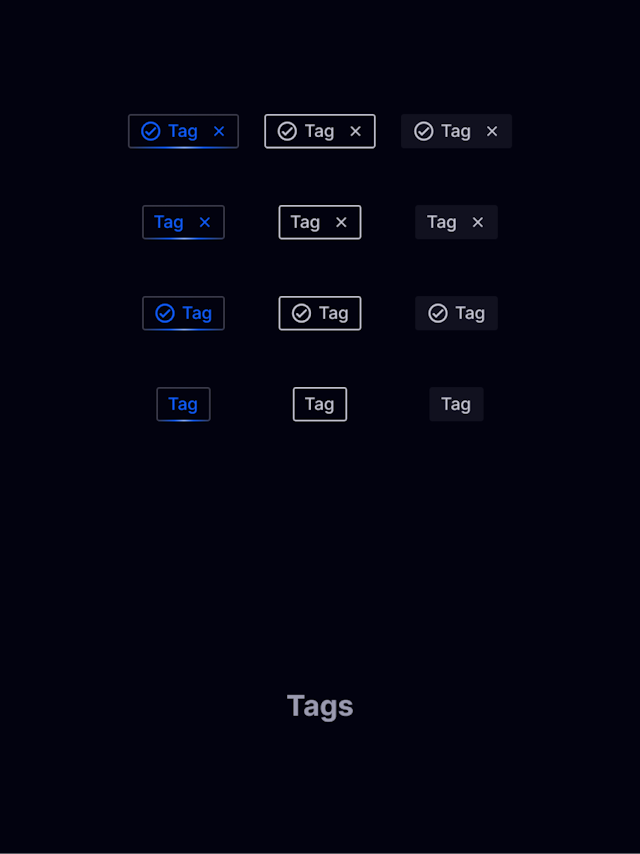
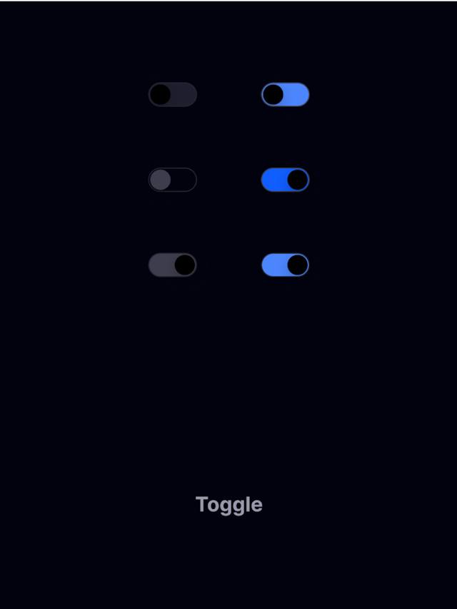
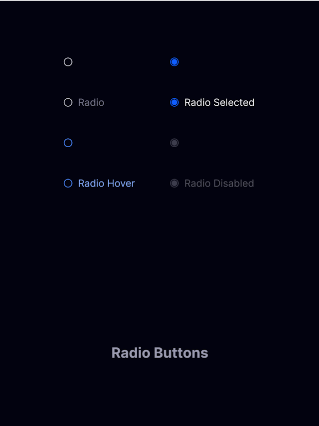
Our collection of enterprise-grade, open-source components provide the building blocks you need to create beautifully designed, scalable, high-performance applications.
Installing Reablocks
Install Reablocks & Tailwind into your React project to get started.
Setup your Tailwind config file with our default color tokens using the link below.
Learn more$ npm install reablocks -S
$ npm install tailwindcss @tailwindcss/postcss postcss -DCreating a custom theme
Extend the default theme to fit your application's unique design language by using extendTheme.
Reablocks provides the ability to customize the style of each individual component using Tailwind, giving you the ease and flexibility to match any design.
Learn moreimport { theme, extendTheme, PartialReablocksTheme } from 'reablocks';
const partialTheme: PartialReablocksTheme = {
components: {
button: {
base: 'bg-lime-600 text-gray-300',
variants: {
filled: 'bg-lime-600 hover:bg-lime-700',
outline: 'bg-transparent border-lime-600 border',
text: 'bg-transparent border-0'
},
sizes: {
small: 'p-2',
medium: 'p-3',
large: 'p-4'
}
}
}
};
export const customTheme = extendTheme(theme, partialTheme)Adding your theme to your application
Wrap your application with ThemeProvider and pass in your new custom theme. This provider applies styling to all your components, ensuring a consistent look and feel.
Learn moreimport { ThemeProvider } from 'reablocks'
import { customTheme } from './theme'
export const App = () => {
<ThemeProvider theme={theme}>
<YourComponents />
</ThemeProvider>
};
